Image
imageLoads images with fade-in, fallback, radius, and optional hover zoom.
Usage
Basic usage
Input src/alt and width/height fixed shell size, fade in after loading is completed.
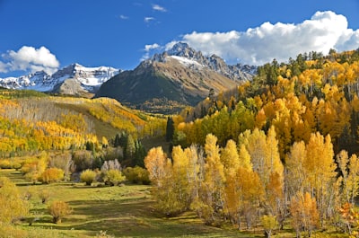
<Image src="/photo.jpg" alt="Landscape" width={200} height={130} />Rounded corners
radius provides none / sm / md / lg / full five-level scale.
<>
  <Image src="/photo.jpg" alt="Landscape" width={120} height={90} radius="sm" />
  <Image src="/photo.jpg" alt="Landscape" width={120} height={90} radius="lg" />
  <Image src="/avatar.jpg" alt="Avatar" width={90} height={90} radius="full" />
</>
hover Zoom (isZoomed)
isZoomed, the casing is cropped and overflows. Move the mouse over the picture to enlarge it.
<Image src="/photo.jpg" alt="Landscape" width={200} height={130} isZoomed />Loading failure and rollback
When the original image fails to load, it switches to fallbackSrc; if the rollback also fails, the placeholder bottom is displayed.

<Image
  src="https://invalid.example/none.png"
  fallbackSrc="/photo.jpg"
  alt="Fallback"
  width={200}
  height={130}
/>
When to use
Use Image instead of a raw <img> when a cover, avatar, or content image needs fade-in, failure fallback, radius, or hover zoom. Use Marquee for a decorative logo wall, or ImageViewer for fullscreen zoom.
Import
import { Image, imageVariants } from "@hulianui/ui"Props
Inherits Omit<ImgHTMLAttributes<HTMLImageElement>, "width" | "height">.
| Name | Type | Default | Description |
|---|---|---|---|
| src * | string | — | Image URL. |
| alt | string | "" | Alternative text; empty by default, so provide meaningful text unless the image is decorative. |
| width | number | string | — | Numeric width or CSS length. |
| height | number | string | — | Numeric height or CSS length. |
| radius | "none"|"sm"|"md"|"lg"|"full" | "md" | Radius scale. |
| isZoomed | boolean | false | Scales on hover within the clipped wrapper. |
| fallbackSrc | string | — | Failure fallback URL; omission shows the placeholder surface. |
| className | string | — | Wrapper class controlling dimensions and clipping. |
| imgClassName | string | — | Inner <img> class. |
| ...img | Omit\<ImgHTMLAttributes, "width"|"height"\> | — | Remaining native image props. |
Usage notes
- Hover zoom relies on wrapper clipping and dimensions; do not move overflow control to
imgClassName. radiusstyles the wrapper. Combineradius="full"with equal dimensions for an avatar.- Consumer
onLoadandonErrorare merged with internal fade and fallback behavior. This fixes issue #55. - The forwarded ref targets the inner
<img>for natural dimensions or intersection logic, matching Input. - Candidate image-related skills describe application workflows rather than this component and are intentionally not linked.
Related
Table · Book3D · ProTable · PricingTable · JsonViewer · EditableTable
Playground
<Image
  src="/photo.jpg"
  alt="Landscape"
  width={220}
  height={140}
/>